Rethinking Global Navigation for a Telecom Provider.
UX Research

My Role: Lead UX Researcher
Project Timeline: 2 weeks, March 2025
Cox Business wanted to reduce confusion in its navigation by segmenting content by business size.
I was brought in to test this approach, and variations, to find a structure that truly matched how users think.
My findings challenged expectations and ultimately shifted the direction of the site’s redesign.
My Research Approach
I led a remote tree test with 75 participants using Userlytics, focused on findability, usability, and alignment with user mental models.
Participants completed 8 real-world tasks, using 3 proposed nav models:
Version 1: Current (Products, Solutions, Business Size in tabs)
Version 2: Bifurcated by Business Size (Client’s preferred model)
Version 3: Hybrid (Business Size + Products + Support)
Sample tree test tasks:
Your company is exploring cybersecurity solutions. Where would you find information about these services?
You are an IT expert within a school district. Where would you go to research solutions?
You want to learn about the features and equipment available with business wifi. Where would you go first?
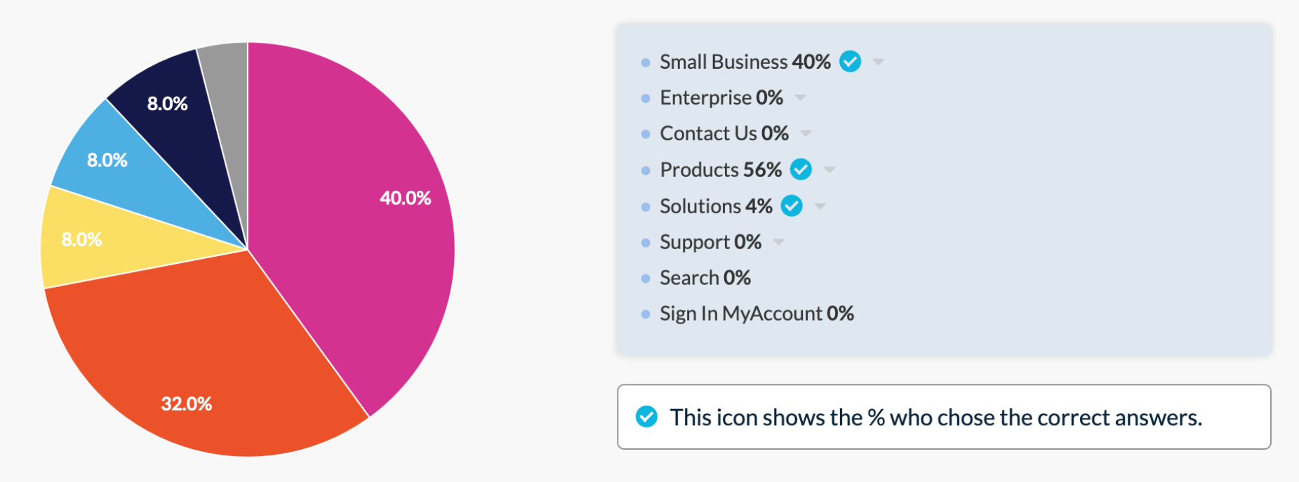
Primary navigation categories
Version 1
Small Business | Enterprise | Contact Us | Products | Solutions | Support | Search | Sign InVersion 2
Contact Us | Small Business | Enterprise | Support | Search | Sign InVersion 3
Contact Us | Products | Business Type | Shop | Support | Search | Sign in to MyAccountFindings Summary
Overall Trends
Users relied on both business size segmentation and product categories. No single mental model dominated.
Some users defaulted to Search or Contact Us, signaling that top-level labels weren’t always clear.
What Worked
Clear category labels improved task success and reduced backtracking.
A hybrid structure that combined business size and product categories had the highest task success rates.
What Didn’t
Vague terms like “Products,” “Solutions,” and “Services” caused confusion.
Deep, multi-layered navigation paths increased frustration and time on task.
User confidence didn’t always match actual success especially in simplified structures with ambiguous labels.
Key Finding: Mental Models
How Do Users Naturally Navigate?
Users did not show a strong preference for either business size segmentation or product/service categories, they used both when given the option.
Recommendations
Ensure menu categories are intuitive, concise, and scannable to reduce reliance on search or customer support for basic information.
Do not limit the global navigation to business size segmentation. Instead, explore how business size distinctions can be reflected at the page level through clear content hierarchy and design elements.
Blend the strongest aspects of the tested navigation structures.
By refining category labels and integrating a hybrid approach, we can create a more intuitive and confidence-inspiring navigation experience.
Key Finding: Higher confidence ≠ Higher success
Confidence vs. Success: The Paradox of Simplicity
Users expressed higher confidence when there were fewer top-level categories.
This suggests that a simplified navigation structure creates a perception of clarity. If category labels are too broad or vague, users can easily go down the wrong path without realizing it.

Example: Only 44% of participants successfully completed the task, yet 92% reported feeling "very" or "extremely" confident in their selection.
Recommendations
Balance simplicity with clarity. Rather than just reducing the number of top-level categories, focus on logical grouping and clear labels to improve findability.
Cluster related content. Group similar items to create intuitive, digestible sections. Limit the number of categories per level to reduce cognitive load. This can be done through both copy and design.
Clarify category labels. Avoid overly broad terms that may cause confusion and ensure each category is distinct and meaningful.
By refining how navigation is structured, we can help users maintain confidence while also improving actual task success.
Key Finding: Unclear Labels = Confusion
Clear Constructs vs. Ambiguous Titles
Cybersecurity
Participants struggled to determine where cybersecurity offerings were located. This was especially true in Version 1, where they had to choose between "Products” and "Solutions.”
The challenge likely stemmed from the fact that users don’t naturally classify cybersecurity as a "product" in the same way they would an internet plan.
Service Outage
In contrast, when asked where to check for a service outage, users more consistently selected “Support”
This suggests that categories aligned with common mental models are easier to navigate.


Recommendations
Use clear, intuitive naming conventions that align with user expectations.
Avoid redundant or overly similar categories (e.g., "Products" and "Services"), as they can create uncertainty.
Leverage UI design and visual chunking to guide users toward niche categories when appropriate.
Intuitive, distinct categories reduce friction and improve efficiency.
Recommendations
We recommended utilizing navigation Version 3 (Hybrid: Organized by Products, Business Size and Support). By restructuring the navigation to be more intuitive, scannable, and well-organized, we can help users maintain confidence while also improving task success rates.
Structural Improvements
Group related items together into logical, digestible clusters to make navigation more intuitive.
Limit the number of categories per level to reduce cognitive load and prevent users from feeling overwhelmed.
Ensure category labels are clear and distinct to prevent overlap and ambiguity, improving wayfinding.
Use category names that support multiple pathways. Ensure users can browse by product, support, and business to accommodate different mental models.
UI & Design Enhancements
Enhanced visual hierarchy. Use size, spacing, and typography to differentiate categories and guide users more intuitively.
Visual chunking. Design the navigation with clear sections and groupings to reduce scanning effort.
Utilize design elements to guide users toward sections needed for product comparison.
Optimize naming, taxonomy, and UI design to help guide users through subsequent steps.
By integrating better structural organization with strategic UI enhancements, we can create a navigation system that aligns with varied mental models, reduces friction, and supports decision-making.
Outcomes + Reflections
The client was confident that bifurcating the navigation by business size would solve user issues. My challenge was to gently but directly show that this approach didn’t support actual user behavior.
Instead, I guided the conversation toward a hybrid structure that allowed for more flexible pathways. I emphasized that business size distinctions could still be reflected at the page level, without creating duplicate nav items or user friction.
The client has aligned on the hybrid navigation model
My research will inform UX wireframes and UI design in Summer 2025
I practiced navigating stakeholder expectations while staying grounded in user evidence